Friday, 14 February 2014

Working with colours


I initially wanted a sweet pastel coloured palette that was sugary, however looking more into kitsch i realised i needed a few more plastic acid hues such as a bright yellow and neon orange, this adds an added depth into normal pastel colours, which tend to come in year in year out for summer collections. 

Below are my first colour boards, which i then developed into final colour scheme. Some of the boards are not finished as i usually place tape over the top of my designs.


First look at pastel candy colours, felt that they needed an added punch 

Looked into blue/Purple/green colour however i think kitsch has an eclectic mix of many colours and so maybe just a few tones from this board to add to the final hues.

Also looking more into depth of pink tones, felt that having just pink hues in a collection doesn't work for kitsch.

Another board that i felt didn't have the right tones. 

Finally decided on colours, think this works great as i have a mix of bright neons and subtle pastels. 


Wednesday, 12 February 2014

S/S15 Collection - Flourescent Pastel Punch

Due to being undecided on a final theme name for the collection i have been avoiding posting blog posts, but aim to start posting ideas every couple of days starting from now (Lets hope i keep up with this).

First start with a concept theme to spark ideas about what the collection is about. Flourescent Pastel Punch (Purposely spelt wrong to merge the words fluorescent and floral) 


A 1950 Hollywood theme that is fun and flirty. Mainly casual style outfits with an option to turn day to night. Florals and unusual patterns/embellishments that are modern kitsch. This collection has a playful 1950’s American diner feel in the form of print and texture, however with the sexier hourglass sillhouettes of the 1950’s. Tongue in cheek humour turned on its head to allow a fashion concious female with an outlandish style to wear this collection as casual day wear relaxing in the sun, or even dressed up for a night out.

The colour concept has spring hues of candy pink and polka dot pastels. This adds the playful, summer at the beach statement.  Overal the pallete is a soft and gentle shade of colour. The muted subtle colour mixed with the gaudy kitsch addition of decorative details. Kitsch items in the home tend to have a slight acid plastic colour of yellow or green. In which the playful spring pastels mixed with the garish tints will add a diverse colour concept.

This collection forms a range of popular garments of the 50’s with a modern twist. Such as seperates, playsuits, crop tops and thin knit jumpers with added textural embellishments. Kitsch is a german word meaning ‘ of bad taste’ however adding a subtle hue of colour and having a garish representation on the sexy sillhouette of the 1950’s will allow kitsch to be appriciated in an ironic way.

Summer at the beach allows cool cottons and linens, also with luxurious silks for the 1950’s glamour. Combining textural knits into the mix to allow wearer to keep warm during nights with a chilly breeze. Some fabrics will have two-tone or hollographic sheen to them, or even a plastic transparent vinyl. This adds a hint of vulgarity, yet used in small proportions will give a fashionable feel.

This collection is a bespoke collection for the average fashion concious female that enjoys all things LA, mostly a casual beach loungewear. The customer market is for females with a more diverse and eclectic taste in fashion, who enjoys making a statement, yet in a classier tasteful way. 

The ‘look’ of the collection is 1950’s American diner with the cheesy plastic feel. Domestic casual women of that era held pin curls in place with head skarfs, which became an opted style for casual days. The silhouette of the 1950’s was mainly a hourglass shape, with the odd exeptions.  Sweet Peter Pan collars and floral prints add a ditsy girly style yet with the hourglass popular shape of the era. The target level is high end, due to luxurious fabrics and intricate detailing within the collection. Although the kitsch feel is aimed to be of bad taste or cheap, this combination of garments will not be inexpensive. 


Wednesday, 8 January 2014

Fluorescent Pastel Punch

For spring summer 2015 i have decided on the theme 'Fluorescent Pastel Punch'


This 24 Outfit collection takes inspiration from 1950 Hollywood theme that is fun and flirty. Mainly casual style outfits with an option to turn day to night. Using florals and unusual patterns with embellishments that are modern kitsch. This collection has a playful 1950’s American diner feel in the form of print and texture. Tongue in cheek humour turned on its head to allow a fashion concious female with an outlandish style to wear this collection as casual day wear relaxing in the sun, or even dressed up for a night out.

The colour concept has spring hues of candy pink and polka dot pastels. This adds the playful, summer at the beach statement.  Overal the pallete is a soft and gentle shade of colour. The muted subtle colour mixed with the gaudy kitsch addition of decorative details. Kitsch items in the home tend to have a slight acid plastic colour of yellow or green. In which the playful spring pastels mixed with the garish tints will add a diverse colour concept.

This collection forms a range of popular garments of the 50’s with a modern twist. Such as seperates, playsuits, crop tops and thin knit jumpers with added textural embellishments. Kitsch is a german word meaning ‘ of bad taste’ however adding a subtle hue of colour and having a garish representation on the sexy sillhouette of the 1950’s will allow kitsch to be appriciated in an ironic way.

Combining textural knits into the mix to allow wearer to keep warm during nights with a chilly breeze. Some fabrics will have two-tone or hollographic sheen to them, or even a plastic transparent vinyl. This adds a hint of vulgarity, yet used in small proportions will give a fashionable feel.

This collection is a bespoke collection for the average fashion concious female that enjoys all things LA, mostly a casual beach loungewear. The customer market is for females with a more diverse and eclectic taste in fashion, who enjoys making a statement, yet in a classier tasteful way. 

The ‘look’ of the collection is 1950’s American diner with the cheesy plastic feel. Domestic casual women of that era held pin curls in place with head skarfs, which became an opted style for casual days. The target level is high end, due to luxurious fabrics and intricate detailing within the collection. Although the kitsch feel is aimed to be of bad taste or cheap, this combination of garments will not be inexpensive.


Wednesday, 11 December 2013

Final technical flats.

Outerwear 1


Outerwear 2


Outerwear 3


Final Illustrations

Below is my final line up of the 3 puff parka style outerwear


Research collating on the trends for A/W


After collating all my research i came to these conclusions mixing the trends already on the hightstreet, along with the trends on WGSN and other fashion forcasting.


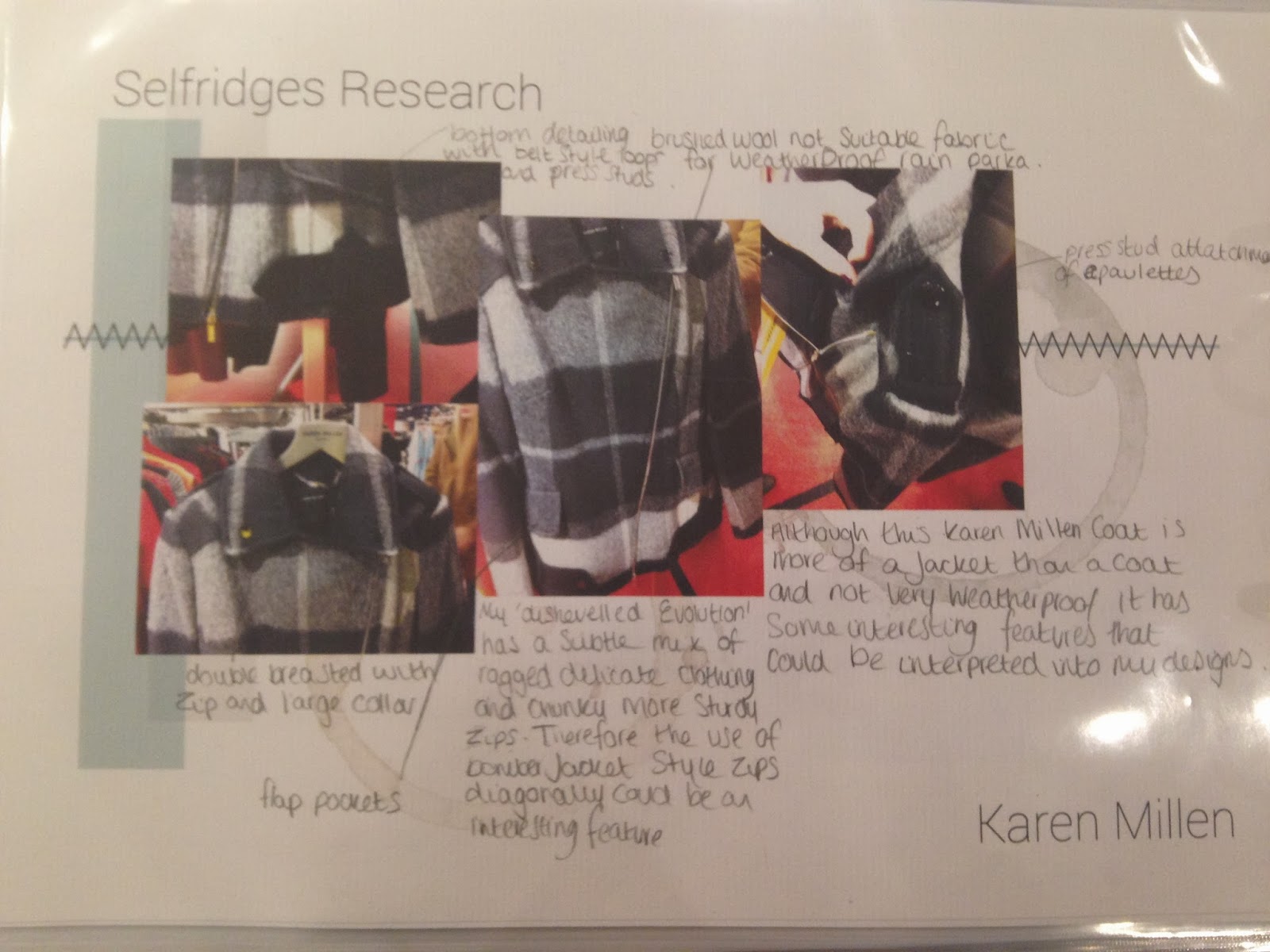
First High street Research- Primary Research in highstreet stores


 Firstly i looked at various coats in deferent shops, hughstreet and designer to get an overall basis of the AW season

i looked at various coats from high end (Karen Millen,Moncler, etc) to hightstreet (Next, Jack Wills etc)
to see similarities in the trends, then compared these to the upcoming trends on WGSN and other forecasting for AW2014/15


i then noticed similarities and collated the information , these will be on the next blog.