Friday 18 October 2013

Knitting Further Research


This week i have tried to experiment more with fabrics so I got my knitting machine out and experimented with making ladders, and adding other threads that are dishevelled and worn to bulk out the knit. This worked extremely well and links perfect with some of my research collected.

knotted knit - chunky layering


laddering

loops ( links to Rodarte Fall 2009 )


mixed fluffy yarns, mixed thicknesses

loops !

lace and laddering

Experimenting with Ink , bleach and fine Liner

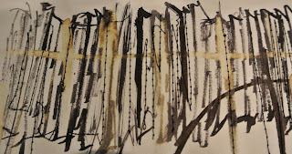
Before working back into my sketchbook i wanted to experiment more this week with ink, bleach and other mark making to find a medium that worked within the theme " Dishevelled Evolution." I created these pieces by adding ripped paper together, drawing over in Ink and finishing off stitching into them . I wanted to create the look that knitwear has when its laddered and ripped, and so reworked into the art work with bleach, This created an unusual colour that is perfect for my colour scheme. These pieces of art work can be interpreted by having them on collage to represent fabrics, and also developed to make prints on some garments.
 Above could represent the rips in a fabric, or ladders in a knit , it could also be used as a print on garments,

Above - ink and bleach to create this rusted effect, i could do this on a piece of fabric to see what effect could be achieved 


above: black ink , bleach and scratched with cocktail stick to create texture.

I also tried out these effects on different papers, this graph paper works great by the dishevelled messy ink and bleach contrasting with the straight lines across the paper.

the rounded ink and bleach represent bobbles and loops in knitwear, mixed with laddered knit ( lined bleach)


I then scanned images into the computer and tried to manipulate them in a way that would work with my concept theme and colour palette.


Overall this week has allowed me to loosen up with my work and really get to grips with what my collection should be about: layering different weighted fabrics, rips, bleached fabrics and knits that are laddered and looped.  

Research- Does my work really portray the 'Dishevelled look'

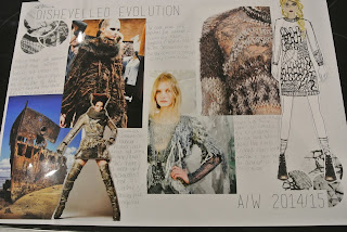
Looking at the research gathered i have formed a basis for the theme "dishevelled evolution" however after getting lost in my thoughts and designing i need to go back and really focus on "dishevelled" To me this is raw edges, fraying, bleached fabrics, laddered knits, Knits that are loose on the body.


Looking at the images below of sample sketches the work is too gathered in at the waist and i have restricted the fabric flow compared to the unusual collages i have created .


The imagery is correct, i just lose the overall 'look' with designing. I need to find a way to interpret the dishevelled almost messy look in my designing.


Friday 4 October 2013

The Overall "Look"


My overall 'Look' i would sum up as grown up grunge, or groomed grunge. As it has an overall dishevelled look with the hair and the loose garments, however it needs to adapt the evolution part of the concept theme and so this 'groomed' is a more clean cut extra that is mixed within the dishevelled. The face of the concept is a very pretty faced girl with sharp cheekbones and a fresh face. However this dishevelled grunge look comes from the messy plaited hair,dark smokey eyes and a deep plum lips.


She has an overall edgy style that is a mix of loose knits and slouchy garments, however with a small dash of structure within the outfit, an evolvement of the simple 'grunge' look. The face below has a fresh face (Freckles not shown on this size of image) Dishevelled hair in a loose plait, dark attractive smokey eyes that has an overall sexy look with the large plum lips. Although grunge tends to be a little more 'just got out of bed' look i went for a cleaner cut fashion face as this suits my overall theme better.


Colour Exploration


Here is my chosen colour palette for my concept theme of "dishevelled evolution." The collection is a Autumn/Winter collection and so i looked into the upcoming trend colours on WGSN and thought about typical colours of disaster and wreckage (rusts, dull colours however with some flashes of brighter tones.)After i looked at certain relevant imagery to link to cracked,weathered etc and linked the colours together to create this palette   
 

 Above is a colour inspiration page i found on WGSN that i think links briefly with the theme and look i am going for. 


The colour scheme was broken into a few more manageable palettes that aid designing as i  can see a few colours that match together and how much of the colour would be best i.e. a garment consisting of mainly Gossamer Grey (which insists a lighter, drape fabric ) with a smaller strip of Winter Blues and Rainy Day Grey (which could be interpreted in detailing/ smaller strips of the fabric within the main fabric.)


Overall this is a strong colour palette as it is a winter colour palette that links with the inspiration of Dishevelled Evolution. The evolution part being a gradual development into something better, which the designs should do!