Tuesday 12 November 2013

Fashion Illustration Heads


Below are 3 of my illustrations faces for Dishevelled Evolution, i tried to stick to the overall 'look' of the collection which is a more grown up grunge style, Therefore i have used messy scruffy dirty blonde and dark smokey eyes. 


Colour direction


Colour direction- I wanted to design a colour palette that has a twist on the usual autumn hues, i have the usual rust and dull colours which are usually present in destruction and wreckage. Sometimes within a catastrophe there is a hint or splash of colour hidden away, in which i have added to my palette a pale pastel pink and a turquoise blue. These are usually quite Summery colours however used in a small amount within the other burnt oranges and rust hues will make an interesting Winter colour palette


Final Lineup

Below is my final layout of 12 outfits that link to the concept direction of Dishevelled Evolution.


Trend Direction

Trend Direction 

Looking at emerging trends for AW2014/15 i have based my work around certain elements, Such as carbon or burnt out fabrics,  as well as engineered laddering of knits. Overall the trend of Industrial Heritage on WGSN summarises my  look. With rough work textures and contrasting textural fabrics that are altered or burnt out. Dishevelled evolution is perfect within these trends and i feel it is up to date and contemporary.


Using collage to aid designing

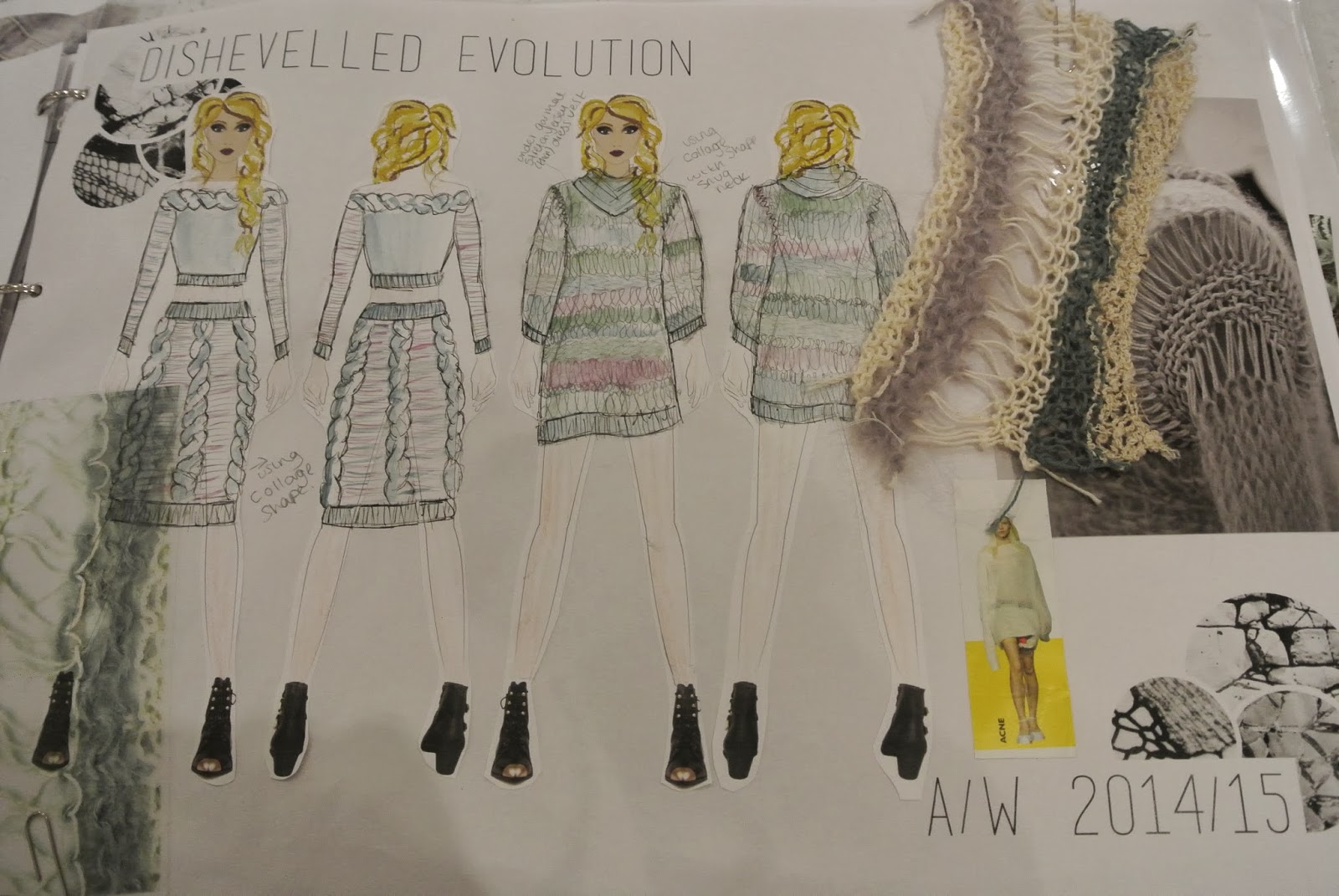
To help me in the process of designing i collaged a number of interesting clothing and my artwork to inspire me to create clothing, below are some of my design sketchbook pages.


I have tried to have a more dishevelled look to my clothing, using ink stains and textured knits/ladders. Using collage has helped to think of ideas that i wouldn't of usually.

 This collage is a silk chemise contrasting with the chunky looped coatigan (coat and cardigan) The silk nightie however has an unusual dishevelled grunge look as it has ink stains up the front, not just any coffee stain but placed in a wavy line diagonally and bleeding the colour out from the main line. 


i also used my bleach artwork as inspiration to create clothing using ripped chiffon  and laying the fabric over eachother to re create the image above. 
ripped and torn layers, sewn together and bleached to look burnt out and dishevelled.


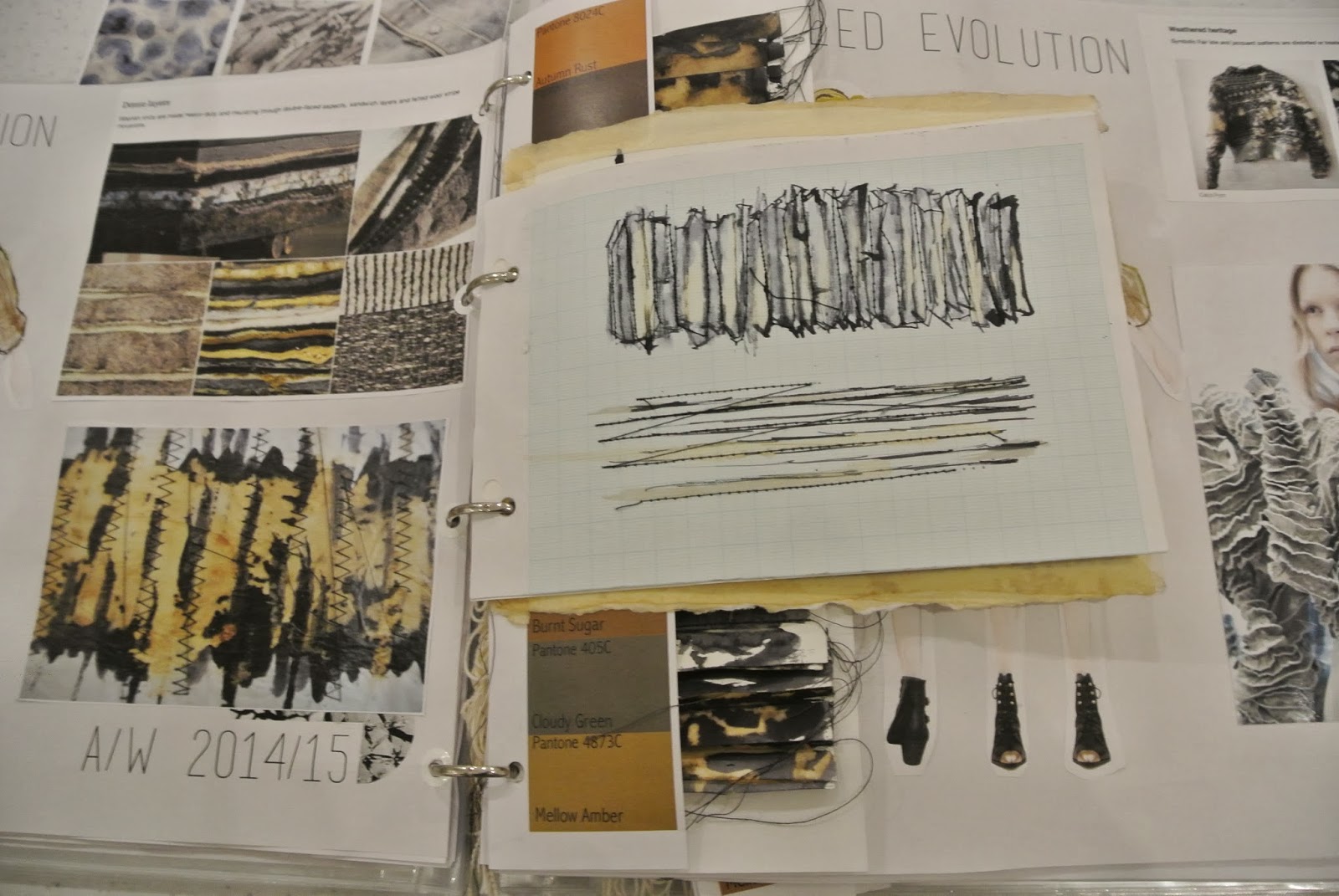
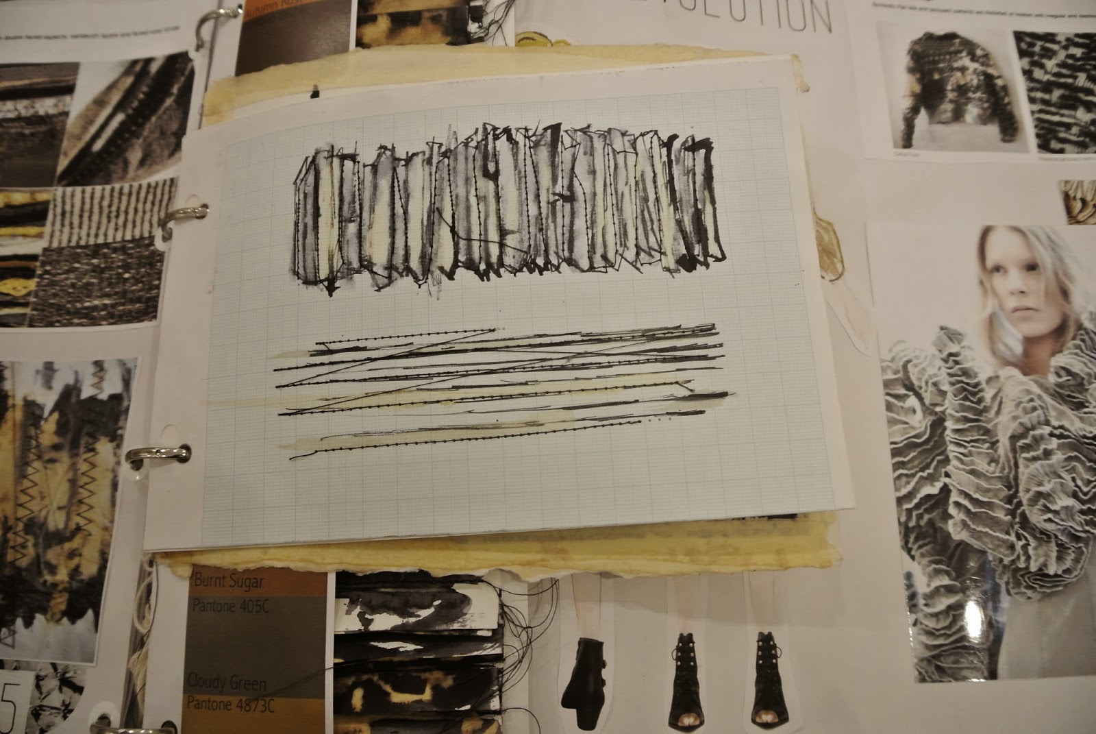
Overall i am working to make my sketchbook link my theme better using more worn fabrics and laddered knits. Thinking more about the theme and not just what i like, trying to aim for the target customer which is a 25-30 fashion concious female with a grown up grunge attitude to clothing.